
The “Cool Blue” Color Trend Is Changing What Wall Art Actually Sells
Pinterest’s 2026 color trend data points toward a specific shift: icy, mineral, and softened blue tones (grouped under the label “Cool Blue”) are rising across bathrooms, kitchens, and architectural surfaces, and the underlying color-preference shift has direct implications for which wall art palette actually works in a room built around this trend.
Where Cool Blue Is Actually Showing Up
Design coverage tracking Pinterest’s 2026 predictions describes Cool Blue’s search behavior as increasingly tied to architectural applications — bathrooms, kitchens, tiled surfaces, glass, and textiles — rather than purely decorative accent choices, which is a meaningfully different signal than a color simply becoming popular for throw pillows or small accessories.
This architectural framing matters for wall art specifically: a color trend embedded in permanent or semi-permanent surfaces (tile, glass, cabinetry) creates a longer-lasting backdrop that wall art then needs to genuinely complement, rather than a temporary accent color that might rotate out within a season or two.
Why Cool Blue Reads Differently From a Generic ‘Blue Is Trending’ Claim
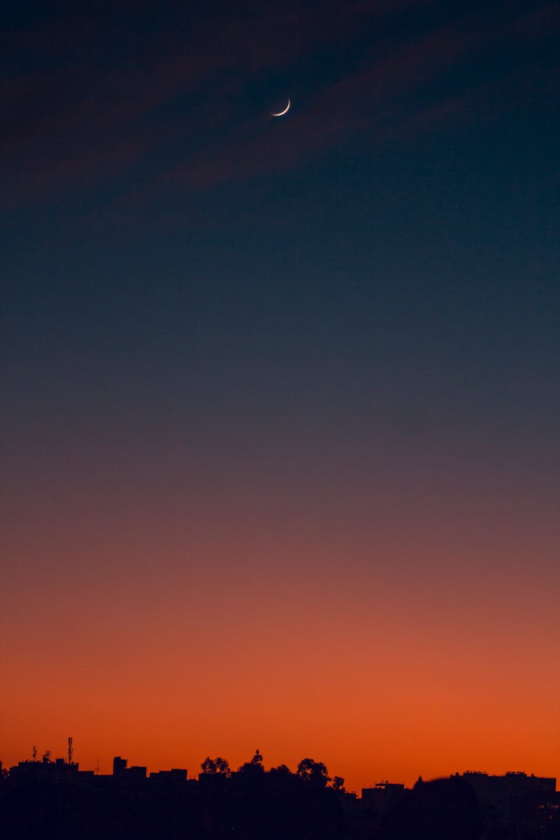
The trend is specifically described as calm rather than simply cold — Pinterest and downstream design coverage frame Cool Blue as offering “calm without relying on neutrality,” distinguishing it from the beige-and-white minimalism that several other 2026 trends (FunHaus, Afrohemian Decor) are explicitly described as reacting against.
This positions Cool Blue as something of a middle path: genuine color and mood, without the maximalist pattern-and-texture commitment that trends like FunHaus or Afrohemian Decor require, which may explain its particular strength in bedrooms specifically, where design coverage notes the trend “really shines.”
Applying Color Theory to Wall Art Within This Trend
Using the standard 60-30-10 interior design proportion, a room committing to Cool Blue as its dominant 60% tone (walls, larger surfaces) has real flexibility for wall art to sit within the analogous blue-green-grey family for a cohesive, calm effect, or to introduce a genuine complementary warm accent (soft copper, brass, warm wood tones) for intentional contrast.
Because Cool Blue is explicitly framed as calming and bedroom-appropriate, wall art choices leaning toward muted, lower-contrast compositions tend to reinforce the trend’s underlying mood more effectively than a bold, high-contrast piece that would compete with the color scheme’s calming intent.
Where This Overlaps With Existing Color Guidance
The complementary-vs-analogous color relationship framework already covered on this site applies directly here — Cool Blue rooms specifically benefit from choosing deliberately between a calm analogous approach and a bolder complementary accent, rather than defaulting to one without considering the room’s actual intended mood.
Nautical and coastal wall decor, already built around blue-toned palettes, sits naturally within a Cool Blue room’s color logic, offering an existing, well-verified category of art that doesn’t require hunting for pieces in an unfamiliar style just to match a color trend.
The Psychology Behind Why Blue Reads as Calming in Interior Spaces
Color psychology research has long associated blue tones with lowered arousal and a calming physiological response compared to warmer colors like red or orange, which tend to be associated with increased alertness and energy — a foundational reason blue has remained a consistently popular choice for bedrooms and other rest-oriented spaces well before this specific 2026 trend emerged.
What Cool Blue specifically adds to that established baseline is a preference for icier, more mineral-toned blues over warmer, more saturated blue-greens — a genuinely different visual and emotional register than, say, a warm navy or teal, even though both fall under the general “blue” umbrella color-theory discussions often treat as a single category.
This distinction matters for wall art selection specifically: a piece with warm undertones (even if predominantly blue) may not actually harmonize with a genuinely icy, mineral-toned Cool Blue room the way a piece with cooler, greyer blue undertones would, making a careful, in-person color comparison more important than judging color family from a product thumbnail alone.
Testing This Palette Before a Larger Commitment
Because Cool Blue is explicitly tied to architectural surfaces (tile, cabinetry, glass) rather than easily swapped decor, testing the palette with wall art and smaller accessories before committing to a tile or cabinetry change is a lower-risk way to confirm the specific shade genuinely suits a room’s natural and artificial lighting conditions.
Natural light exposure changes how any blue tone reads throughout the day — a genuinely icy, mineral-toned Cool Blue piece can look notably different under warm evening lamp light than under cool daytime natural light, which is worth observing in the actual room before finalizing a wall art choice meant to anchor the palette.
For renters or anyone hesitant to commit to permanent architectural changes, leaning on wall art and textiles to introduce Cool Blue tones offers most of the trend’s calming visual effect without the cost or commitment of retiling or replacing fixed surfaces.
Where Cool Blue Sits Relative to Other 2026 Color Trends
Compared to the bolder, more saturated palettes associated with trends like FunHaus or Afrohemian Decor covered elsewhere in this series, Cool Blue represents the more restrained, calming end of 2026’s overall color landscape — useful context for buyers deciding which trend direction actually suits their personal taste and existing home rather than chasing every trend simultaneously.
Because architectural color trends generally have longer staying power than accent color choices, Cool Blue is reasonably likely to remain relevant beyond a single year, making wall art investments aligned with this palette a lower-risk choice than pieces tied to more explicitly dated or novelty-driven trend labels.
Cool Blue Wall Art Pairing Guide
| Approach | Effect |
|---|---|
| Analogous (blue-green-grey palette) | Cohesive, calm — reinforces the trend’s core mood |
| Complementary (warm copper/brass accent) | Intentional contrast, still color-theory sound |
| High-contrast, saturated pieces | Risks competing against the trend’s explicitly calming intent |
Frequently Asked Questions
Design coverage notes it’s particularly strong in bedrooms specifically, but Pinterest’s underlying data ties it to bathrooms, kitchens, and broader architectural surfaces as well, not bedrooms exclusively.
It’s specifically framed around architectural, semi-permanent applications (tile, glass, cabinetry) rather than decorative accents, and described as calm rather than simply cold or trendy.
Both are valid using standard color theory — an analogous blue-green-grey palette reinforces calm cohesion, while a complementary warm accent (copper, brass) introduces intentional contrast without clashing.
Yes — blue-toned coastal and nautical decor sits naturally within this trend’s existing color logic without requiring an unfamiliar new style search.
It can, but icy, mineral-toned blues can read as colder in low-light conditions than in bright natural light, so testing the specific shade in your actual room’s typical lighting before committing is worthwhile.
Yes — the contrast between a cool blue palette and warm wood tones is a common and effective complementary pairing, adding warmth without undermining the palette’s overall calming effect.
The Bottom Line
Cool Blue’s real distinguishing feature is its architectural staying power — it’s embedded in tile, glass, and cabinetry rather than a rotating accent color, which means wall art choices within a Cool Blue room benefit from deliberate, color-theory-informed decisions rather than a quick seasonal match. For anyone weighing multiple 2026 color directions at once, Cool Blue’s architectural grounding and calming intent make it one of the lower-risk choices in this year’s broader trend landscape to build wall art decisions around.