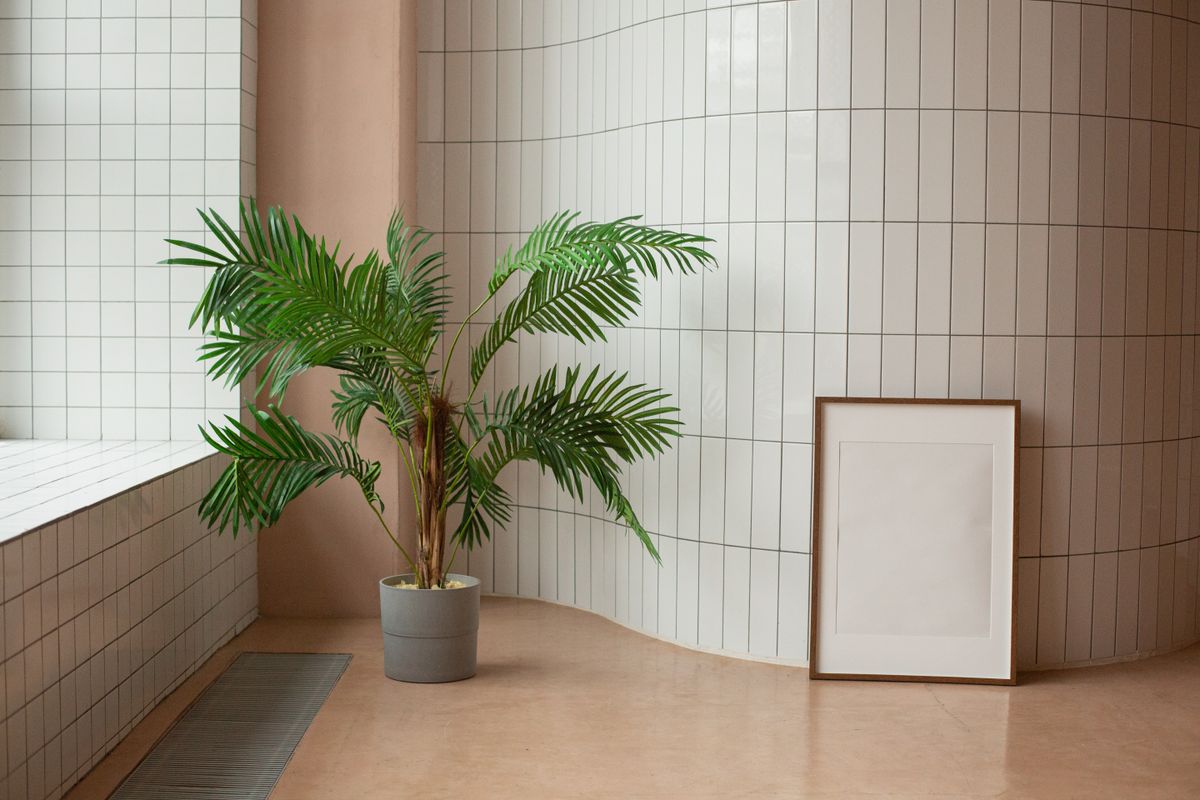
Pantone’s Colour of the Year for 2026 is Cloud Dancer (PANTONE 11-4201), a balanced, softly luminous white described by the Pantone Color Institute as carrying an equal blend of warm and cool undertones. It marks the first time in the programme’s history, running annually since 1999, that Pantone has chosen a shade of white, a genuinely notable shift after recent years favoured warmer, richer tones including 2025’s Mocha Mousse and 2024’s Peach Fuzz.
According to the Institute, Cloud Dancer was chosen to reflect a cultural moment of “measured consideration and quiet reflection,” a calming counterpoint to an increasingly fast-paced, technology-saturated daily life. In interior design specifically, the Institute describes the tone as offering “clarity without coldness, structure without severity,” and suggests it pairs particularly well with natural materials like wood and stone.
Understanding Cloud Dancer’s Specific Character
What distinguishes Cloud Dancer from a simple bright white is its genuinely balanced undertone, neither aggressively warm nor coldly clinical, positioning it as a versatile structural backdrop rather than a dominant statement colour in its own right. This balanced quality is precisely why the Institute describes it as “scaffolding” that allows other colours to shine, rather than a colour intended to be the star of a palette.
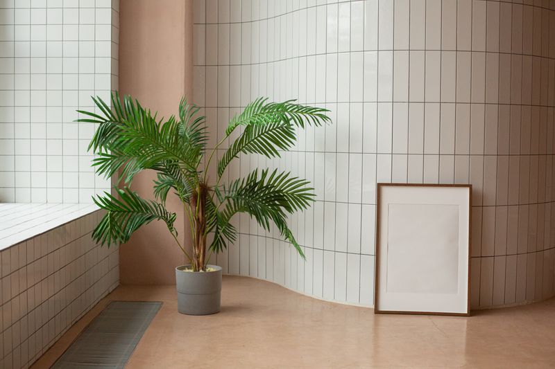
Wall Art Strategies for a Cloud Dancer-Influenced Room
Pastel and Muted Accent Art
Pantone’s own palette guidance suggests pastel and neutral tones as natural companions to Cloud Dancer, soft botanical illustration, gentle watercolour abstracts, and muted tonal photography all extend this quiet, considered mood.
Natural Material Art and Framing
Given the Institute’s specific suggestion that Cloud Dancer pairs well with wood and stone, art incorporating genuine natural materials, ceramic wall pieces, wood-framed botanical prints, stone-toned abstract work, complements the colour’s intended direction particularly well.
Deeper Shadow Tones for Contrast
Pantone’s guidance also describes Cloud Dancer dissolving into “a veiled palette of softened hues that ultimately dissolve into shadowy shades,” suggesting that deeper, moodier art, charcoal abstracts, dark botanical illustration, can create the “easy and effortless contrast” the Institute describes as part of the colour’s intended versatility.
| Approach | Art Direction | Why It Works |
|---|---|---|
| Quiet pastel layering | Soft botanical, gentle watercolour abstracts | Matches the calm, reflective mood Pantone describes |
| Natural material emphasis | Ceramic art, wood-framed prints, stone tones | Aligns with Pantone’s specific material pairing guidance |
| Shadow contrast | Charcoal abstracts, deep moody florals | Creates the ‘effortless contrast’ the palette guidance suggests |
A Note on Trend-Following
Annual colour announcements are genuinely useful as a snapshot of broader cultural and design mood, but they work best as inspiration rather than obligation. Cloud Dancer’s specific appeal, calm, structural, quietly versatile, suits some rooms and personal tastes far better than others, and the most successful approach uses the year’s direction as one input among several rather than a rule to follow regardless of your space’s actual character.

Soft Pastel Botanical Print Set — Cloud Dancer Companion
Gentle pastel botanical print set, directly complementing Pantone’s suggested 2026 palette direction.
$42 View on Amazon
Natural Wood Frame — Material Pairing Appropriate
Genuine natural wood frame, aligning with Pantone’s specific guidance on Cloud Dancer’s material pairings.
$48 View on Amazon
Charcoal Abstract Canvas — Shadow Contrast Piece
Deep charcoal abstract canvas, providing the ‘shadowy’ contrast Pantone’s palette guidance describes.
$78 View on Amazon
Ceramic Wall Art — Natural Material Texture
Hand-finished ceramic wall piece, bringing genuine natural material texture into a Cloud Dancer-influenced room.
$58 View on Amazon
Original Muted Abstract Painting — 2026 Palette Inspired
Original abstract painting in soft, muted tones genuinely inspired by the 2026 colour direction.
Shop on Etsy
Farrow and Ball Paint Colour Consultation
Official Farrow & Ball colour consultation service for coordinating your room’s full palette direction.
Visit Farrow & Ball✕ What to Avoid
- Treating Cloud Dancer as a statement colour; Pantone explicitly describes it as a structural, supporting tone instead
- Ignoring the official guidance on natural material pairing when selecting frames and art mediums
- Following trend colour direction rigidly when it doesn’t genuinely suit your room’s existing character or your own taste
- Choosing harsh, stark white art or framing when Cloud Dancer’s appeal specifically lies in its soft, balanced undertone
- Overlooking the suggested shadow-tone contrast option in favour of an entirely pastel, low-contrast room