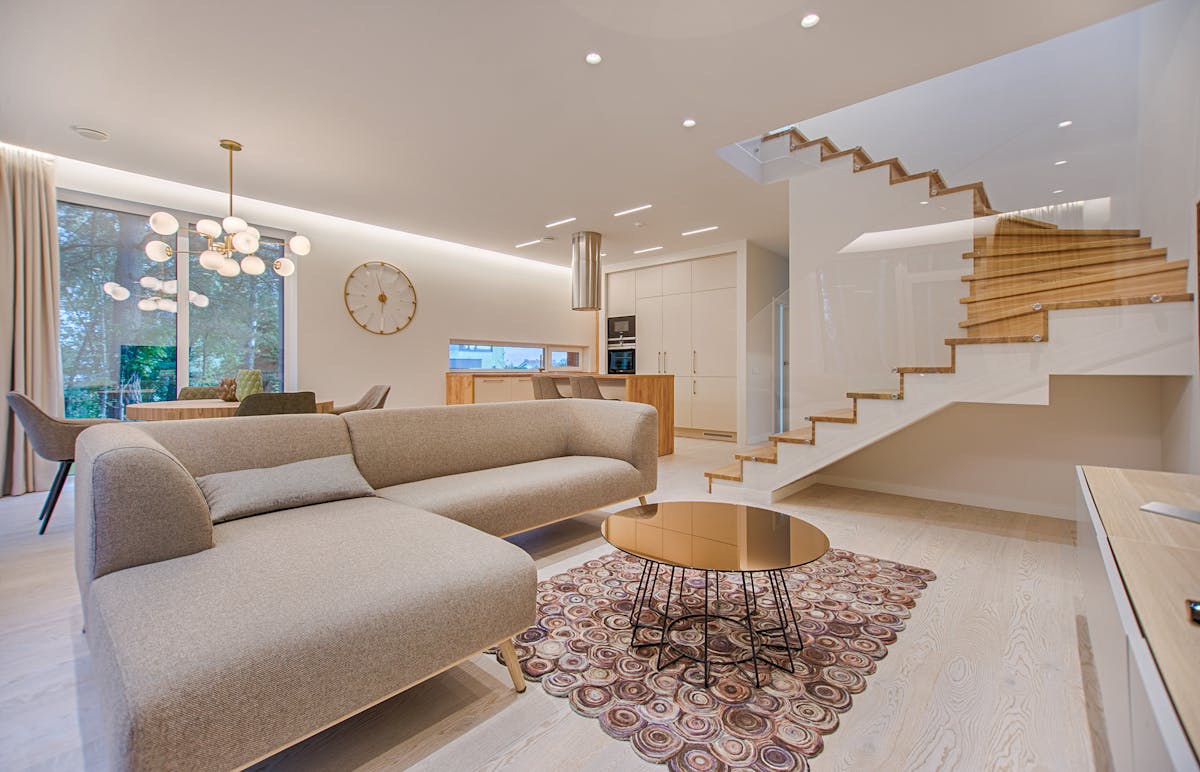
The grey sofa is, statistically, the world’s most popular living room choice. Walk into any furniture showroom and you’ll find them in every shade from barely-there silver to near-black charcoal. They’re popular for good reason: grey is genuinely neutral, endlessly flexible, and kind to almost every other colour in the spectrum. But that flexibility comes with a trap. Because grey doesn’t demand anything from you, it’s surprisingly easy to make choices that feel completely flat.
The living room wall above and around a grey sofa is prime real estate. It’s the first thing anyone sees when they enter the room. Done well, it makes the entire space feel considered and alive. Done badly — too small, too safe, wrong palette — it makes even an expensive sofa look like a showroom floor sample that nobody has properly moved in around.
This guide gives you the specific rules that interior designers use when styling art for grey sofas. Not vague advice about “contrast” and “personality” — real guidance about sizes, palettes, formats, and the specific mistakes that plague the most common grey-sofa rooms.
Understanding Your Grey First
Not all greys are equal, and this matters enormously for art selection. Before you choose a single print, identify which undertone your sofa actually has. Hold a white piece of paper next to it in natural light. The grey will either push toward blue-purple (cool grey), toward beige-brown (warm grey), or sit as a true neutral.
Cool greys pair beautifully with art that leans into blues, blue-greens, crisp whites, and true blacks. Abstract photography, architectural prints, and coastal art all thrive here. Warm greys (greige) call for warmer palettes — terracotta, ochre, dusty pink, sage green. Botanical prints, warm-toned photography, and watercolour landscapes feel entirely natural. True neutral greys are the most genuinely flexible and can carry almost any art style, making them both the easiest and most dangerous — the temptation to play it safe is highest here.
The Size Rules for Sofa Art
The single most common mistake in sofa art is choosing pieces that are too small. A print that looks substantial on an Etsy listing feels lost in an actual room. The rule most designers use: the art or art arrangement above a sofa should occupy 60–75% of the sofa’s width. For a standard 2.2m three-seater, that means artwork or a gallery arrangement spanning at least 130–165cm wide.
| Sofa Width | Recommended Art Width | Format Options |
|---|---|---|
| Under 1.6m (loveseat) | 95–115cm | Single large print or diptych |
| 1.6–2.0m (2-seater) | 100–140cm | Single, diptych, or 3-piece |
| 2.0–2.4m (standard 3-seater) | 130–165cm | Gallery wall or large format |
| Over 2.4m (large sofa) | 160–200cm+ | Gallery wall or oversized single |
Height matters almost as much as width. The bottom edge of any art or arrangement should sit roughly 15–20cm (6–8 inches) above the sofa back. This creates visual connection between the furniture and the art — close enough to feel intentional, far enough to breathe. If you hang art too high, it floats disconnected from the room.
Colour Palettes That Actually Work With Grey Sofas
Option 1: Monochromatic with Black and White Photography
This is the fail-safe. Black and white photography — especially architectural, landscape, or abstract — never clashes with grey because it exists in the same tonal family. The key is to choose photography with real depth and contrast rather than flat, washed-out images. Street photography, mountain ranges, and dramatic cloud formations all work particularly well.
Option 2: Terracotta and Rust Accents
For warm greys, terracotta is the designer’s go-to. The earthy warmth creates genuine contrast without ever feeling jarring. Abstract paintings with terracotta, ochre, and burnt sienna tones are enormously popular right now — and for good reason. They give a grey living room the warmth it lacks while remaining visually sophisticated.
Option 3: Navy and Teal
For cool greys, deep blues and teals provide striking contrast. Botanical prints in deep teal and navy, abstract ocean photography, and indigo-toned watercolours all create a room that feels pulled together without effort.
Option 4: Muted Sage and Forest Green
Botanical art in sage, dusty green, and forest tones has become one of the dominant trends of the 2020s — and it works particularly well with grey sofas because green and grey have a natural affinity. They’re both quiet, slightly cool, and fundamentally calming colours.
The Best Wall Art for a Grey Sofa — Our Picks

Oliver Gal Abstract Canvas Art — Grey & Gold Tones
Museum-quality stretched canvas in muted grey and gold abstract — perfect width at 40×30 inches for most sofas.
$89 View on Amazon
Designovation Sylvie Gallery Wall Frame Set
Set of 4 matching black frames — the easiest way to build a cohesive gallery above a grey sofa without measuring stress.
$64 View on Amazon
Large Black and White New York Photography Print
Dramatic cityscape photography in genuine B&W — works with both cool and neutral grey sofas.
$45 View on Amazon
Kate and Laurel Calter Framed Abstract Art
Soft abstract in creamy tones with warm undertones — ideal for greige and warm grey sofas.
$72 View on Amazon
Terracotta Abstract Set of 3 Prints
Handcrafted abstract prints in earthy terracotta and cream — designed specifically for warm-toned grey sofas. Unframed, multiple sizes.
View on Etsy
Botanical Fern Gallery Wall Set — Sage Green
Six individual botanical illustrations in muted sage — builds a full gallery above a standard 3-seater sofa.
View on Etsy✕ What to Avoid
- Art that perfectly matches your grey sofa — this creates a monochromatic blur rather than a focal point
- Very small prints hung individually above a large sofa — they’ll look lost regardless of how good the art is
- Overly bright neon colours — they can work but require expert coordination and rarely feel timeless
- Prints with thin, ornate gold frames on a contemporary grey sofa — the styles often clash
- Hanging art too high — the most common DIY mistake; bottom edge should be 15–20cm above sofa back
Gallery Wall vs Single Statement Piece
The question of gallery wall versus single large statement piece is one of the most common decisions in living room art. Both approaches work above a grey sofa — they just create very different rooms.
A single large statement piece is confident and editorial. It creates maximum impact with minimum effort and tends to age well. If you find one piece you genuinely love at the right scale, this is often the strongest choice. The risk is that if the art doesn’t work, it’s very obvious.
A gallery wall creates warmth, personality, and visual interest over a broader area. It allows you to combine different types of art — photography, illustration, typography, mirrors — in a way that feels collected rather than decorated. The risk is in the execution: badly spaced or poorly framed, gallery walls look chaotic rather than curated.