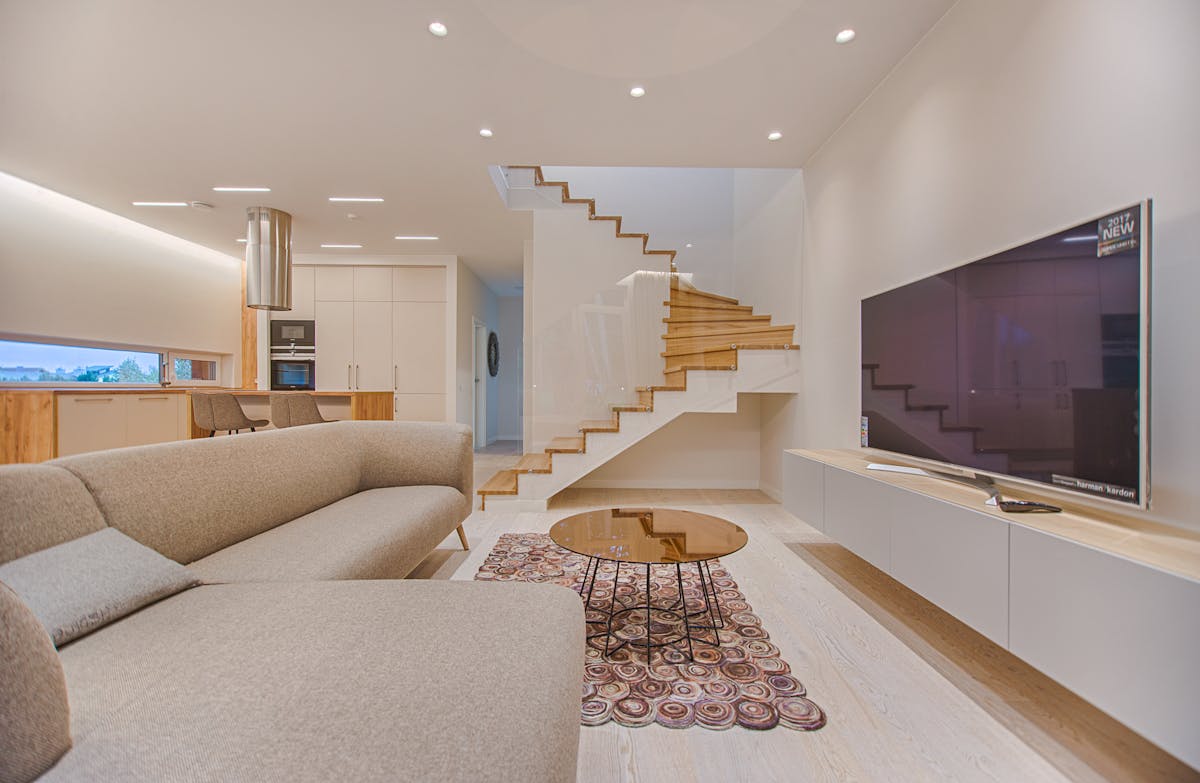
Cream and beige sofas are having a quiet moment of their own. After years of grey dominance, the warm neutrals are reasserting themselves — and in rooms with natural materials (rattan, linen, jute, pale oak), they look genuinely beautiful. The challenge is that cream and beige are inherently quiet colours that can easily become washed out or formless if the art around them doesn’t provide the right kind of definition.
The art above or beside a cream or beige sofa has a specific job: add depth and definition without overwhelming the sofa’s inherent softness. This requires understanding what the sofa actually brings to the room and choosing art that adds what’s missing rather than duplicating what’s already there.
Reading the Undertone of Cream and Beige
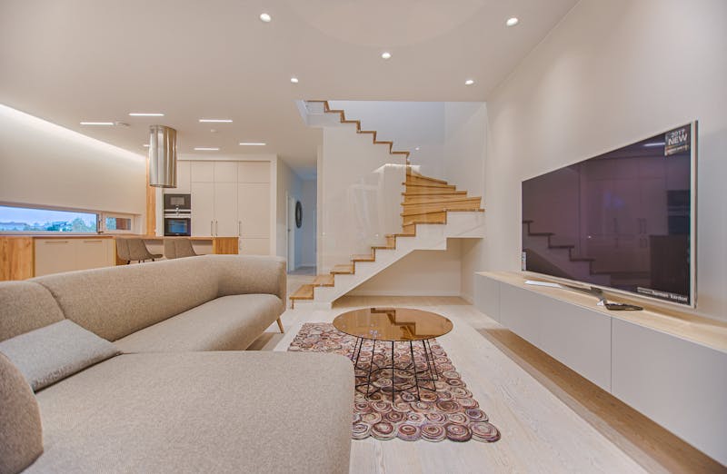
Most cream sofas have a yellow or pink undertone. Beige sofas lean toward yellow-brown. Oatmeal and linen tend toward grey-beige. Identifying the exact undertone helps you choose art colours that harmonise rather than clash — warm-undertone art for warm-undertone sofas, and so on.
What Art Works Best With a Cream or Beige Sofa
Rich, Saturated Botanical Prints
The most reliable art choice for a cream or beige sofa is botanical illustration — but in richer, more saturated versions rather than the pale varieties that would be lost against the neutral sofa. Deep green palm leaves, vibrant tropical florals, and densely coloured garden illustrations all create the definition and depth that cream sofas need.
Warm Abstract Art
Abstract art in warm ochre, terracotta, burnt sienna, and gold creates a tonal warmth that feels entirely continuous with the sofa without blending into it. These palettes have enough depth to create definition while remaining sympathetically warm.
Black and White Photography
The contrast of crisp black-and-white photography against a cream sofa is one of the most elegant and timeless combinations in interior design. The sofa provides warmth; the photography provides definition and visual interest. This combination works across every interior style from contemporary to traditional.
Natural and Organic Textures
Art that references natural textures — stone, water, weathered wood, sand — feels harmonious with cream and beige because these sofas are themselves natural in character. Macro photography of natural textures, abstracted landscapes, and mineral-inspired prints all feel appropriate.

Deep Botanical Palm Print Set — For Neutral Sofas
Rich, saturated tropical botanical prints — provide exactly the depth that cream and beige sofas need.
$38 View on Amazon
B&W Abstract Photography Print — Large Canvas
Large black-and-white abstract canvas — the high-contrast monochrome defines perfectly against cream sofas.
$62 View on Amazon
Warm Terracotta Abstract — Earth Tones
Abstract in terracotta, ochre, and warm brown — a natural extension of the cream sofa’s warmth with added depth.
$35 View on Amazon
Wabi-Sabi Photography Print — Natural Texture
Quiet photography of natural textures and organic forms — deeply harmonious with linen and cream sofas.
$45 View on Amazon
Vintage Botanical Illustration — Dark Green on Cream
Classic vintage-style botanical in deep green on cream background — the canonical pairing for cream sofas.
View on Etsy
Japanese Nature Print — Wabi-Sabi Style
Minimalist Japanese-influenced nature print in warm neutrals — deeply appropriate for cream and natural material rooms.
View on Etsy✕ What to Avoid
- Art in the same tonal range as the sofa — cream art on a cream sofa in a cream room has no definition
- Very cool blue-grey tones — they clash with the warmth of cream and beige
- Small, delicate prints that get lost — cream sofas need substantial art to anchor them
- Overly bright or neon colours — they make the sofa’s warmth look dirty by comparison
- Thin wire or very delicate frames — they don’t provide enough weight to balance the sofa’s softness