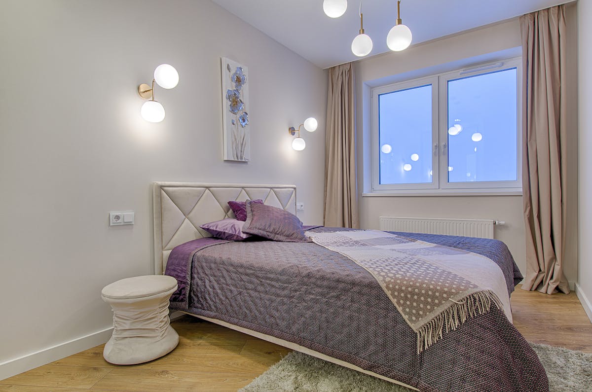
Small living rooms are the most common design challenge in urban homes. And while clever furniture choices and mirrors are frequently cited solutions, wall art is consistently underestimated as a space-expanding tool. The right art genuinely changes how large a room feels — not through illusion exactly, but through the psychology of visual experience.
This guide gives you the specific art choices, arrangements, and placement strategies that interior designers use to make small living rooms feel genuinely larger. These are not vague suggestions — they’re specific, evidence-based recommendations that you can apply immediately.
The Science of How Art Changes Perceived Space
Human spatial perception is strongly influenced by visual cues about depth, distance, and scale. We judge how large a space is partly by the cues we can see within it — and art can provide extremely powerful false cues that expand perceived space significantly.
Research in environmental psychology shows that rooms with large-format photographic landscapes are consistently rated as larger than identical rooms with equivalent-sized abstract prints. The reason is simple: our brains process photographic depth cues (perspective, atmospheric haze, foreground-midground-background separation) as real space even when we know we’re looking at a flat surface.
The Rules for Space-Expanding Art
Rule 1: Go Larger Than Feels Comfortable
Small rooms make people want to use small art — it feels proportionate. This is exactly wrong. Large art in a small room makes the room feel bigger; small art makes it feel smaller by emphasising how limited the wall space is. In a small living room, use the largest single piece the wall can accommodate, leaving roughly 20cm margins on each side.
Rule 2: Choose Light Tones and Pale Backgrounds
Art with predominantly light, pale, or pastel tones reflects more light into the room and creates less visual weight against the wall. Dark, heavily saturated art acts as a visual black hole — drawing the eye in and making the wall feel closer. Keep art backgrounds light and airy.
Rule 3: Depth Cues Are Your Friend
As noted above, art with visual depth — landscapes, seascapes, interior photography, forest paths — expands perceived space through depth cues. Abstract art with no depth cues keeps perception flat. Choose representational or photographic art with clear foreground-background separation wherever possible.
Rule 4: Avoid Gallery Walls in Very Small Spaces
Gallery walls create visual complexity that makes a room feel busier and therefore smaller. In rooms under 15m², use one or two carefully chosen pieces rather than multiple smaller ones. The restraint actually helps.
Rule 5: Use Vertical Formats to Raise the Apparent Ceiling
Tall, vertical art draws the eye upward and makes ceilings feel higher. In a small room with standard ceiling height, a vertical print (60×90cm or similar) does more for the sense of space than a horizontal equivalent.

Large Format Landscape Photography — Mountain Vista
Single large landscape photograph with strong atmospheric perspective — the most effective art choice for expanding perceived space.
$68 View on Amazon
Abstract Watercolour Print — Pale Blue Tones
Soft watercolour abstract in pale blue and white — light-toned, airy, and perfect for small spaces.
$38 View on Amazon
Forest Path Photography Print — Large Canvas
Immersive forest path with strong linear perspective — maximum depth cue for space expansion.
$55 View on Amazon
Minimalist Line Art — Arch and Circle, Pale Tones
Clean minimalist line art in cream and white — the simplicity and light tone keep small rooms feeling spacious.
$29 View on Amazon
Coastal Seascape Print — Horizon Photography
Large coastal seascape with open horizon — blue sky and sea create maximum perceived depth.
View on Etsy
Minimalist Mountain Line Print — White Background
Simple mountain outline on white — the restraint and light tone are ideal for making small rooms feel larger.
View on Etsy✕ What to Avoid
- Small prints that leave large expanses of wall visible — the visible emptiness emphasises the room’s limits
- Dark, heavily saturated art — it acts as a visual weight that pulls walls inward
- Busy gallery walls in rooms under 15m² — the visual complexity makes the room feel smaller
- Art with very strong warm tones against white or cream walls — warm colours advance, making walls feel closer
- Horizontal landscape-format prints when the room lacks horizontal space